Table of Contents Show
Comic book covers have been typically known to showcase a strong man rescuing a damsel in distress, saving a burning city, or fighting back against a monstrous enemy. Despite the times changing, most comic book covers have been created by men, for a male demographic, revolving around male characters. Rarely have we seen empowered women, or any female representation at all for that matter. Comic book covers featuring women have been constantly used as a tool to add an element of romance or sex. So, when have female superheroes had their time to shine on comic book covers? (( “BBC.” bbc.com, 2018. ))
Therein lies the never-ending sexism problem of comic book covers. Almost every single time a female character has had her “moment” on a cover, it was immensely sexualized. Women were solely used as a sex symbol to attract readers to the storyline. They were constantly being drawn in exceedingly risqué “barely there” clothing or without any clothing all. The intention here was to stimulate comic books sales through provocative imagery in order to get readers interested in a female-centered story. Let’s go ahead and take a look at the top five most sexist comic book covers of all time.
5. Powerhouse Or Powerless?
The She-Hulk covers were notoriously known for their overtly sexist depiction of Jennifer Susan Walters, better known as She-Hulk. These comic book covers have consistently illustrated a half-naked woman with completely unrealistic body standards. This particular cover was one of the most sexist, baffling, and humiliating covers of all time. The Sensational She-Hulk #40 (1989-1994) showed a fully naked She-Hulk, as she attempts to cover herself with a single newspaper. (( “The Daily Fandom.” thedailyfandom.org, 2020. ))
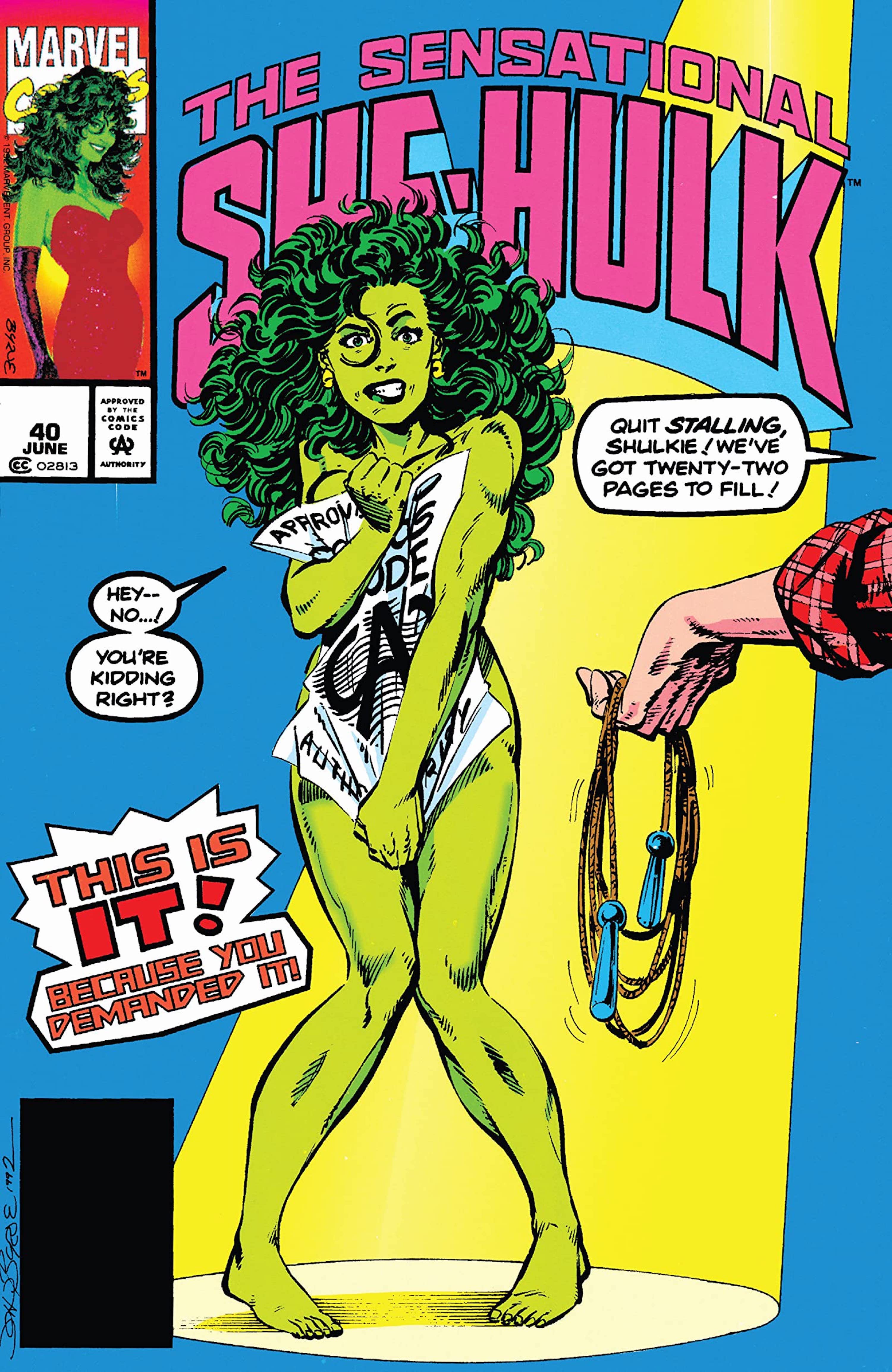
Just by breaking down the character’s body language, readers would immediately notice how her knees are buckling and how her hands are spreading the newspaper out as far as possible to avoid complete exposure. She-Hulk’s facial expression displays complete shock and mortification. The character looks as if someone had just caught her changing in her own privacy. The words, “Quit stalling, She-Hulk! We’ve got twenty-two pages to fill!” came off as forceful and aggressive. On top of this, She-Hulk was shown saying, “You’re kidding, right?” This line revealed that the superhero felt uncomfortable with something that she was being pushed into doing. This cover was beyond demeaning, humiliating, and sexist. Additionally, this made the viewer feel as if they were secretly getting a peek at a woman at her most vulnerable moment. (( “Comixology.” comixology.com, 2016. )).
In the comics, She-Hulk was described as a “strong, tough, powerhouse of a superhuman,” so why was that not presented in any way, shape or form? One would have thought that the word “sensational” would have somehow translated into the illustration. Unfortunately, those words were just for show, as the creators believed that they would not sell the product off the shelves.
4. Scale That Skyscraper, And Make It Sexy!
There was no getting around the intentions of this sexist comic book cover. The cover of Spider-Woman #1 (2014) went down as one of the most degrading female superhero illustrations of all time. Several versions of this drawing, with the “Spider-Woman” title removed, where a much more scandalous photo was able to be viewed. What did this cover say to readers? ‘Check this cover out; look how sexy she looks!’ ‘Don’t you want to see what other racy photos are inside?’
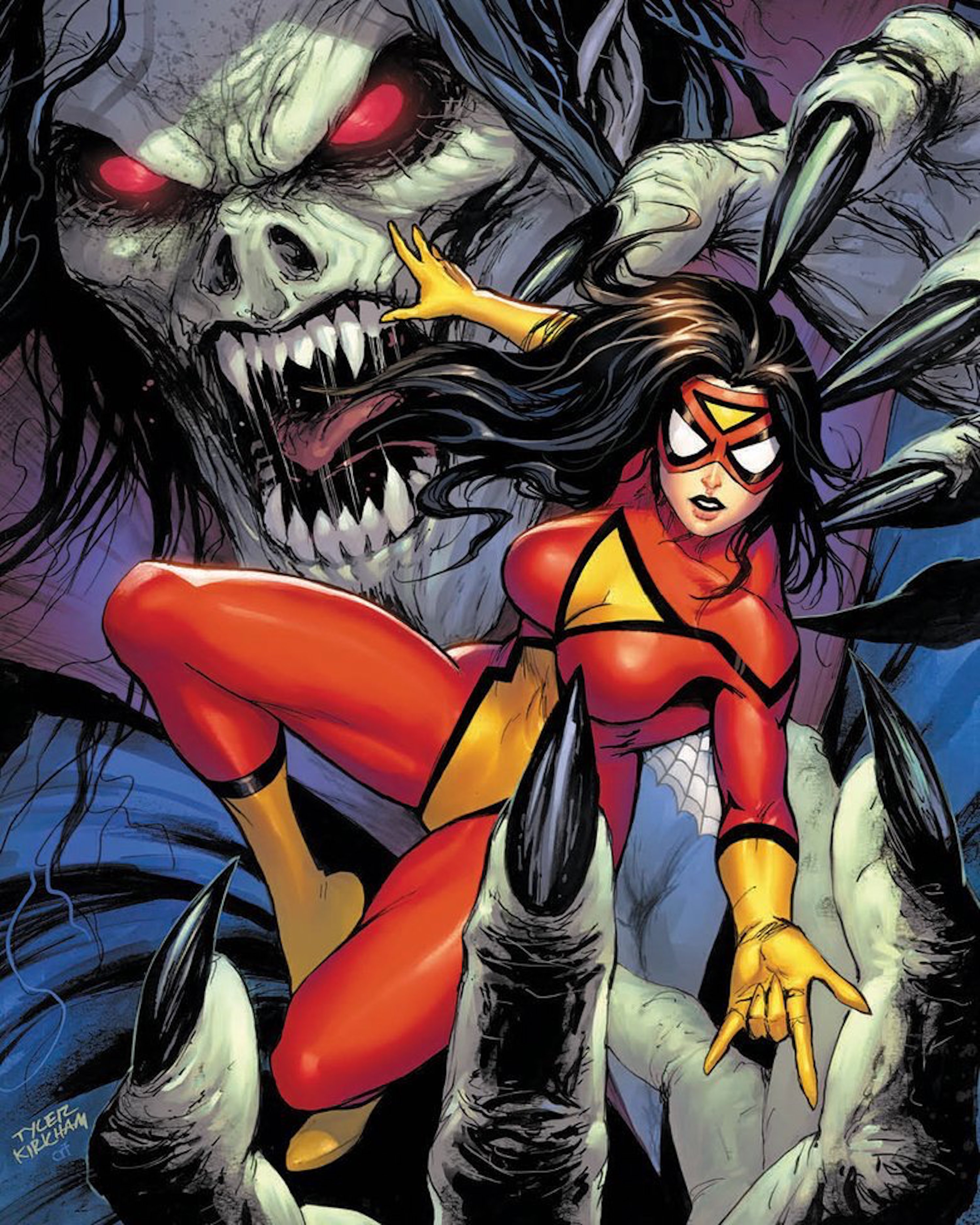
One has to wonder, where was the insight in Spider-Woman being a master spy or a superhuman with insanely heightened senses? This sexual crouching position places the character on the top of the building, where she would be able to show off her rear more than the fact that she was able to scale the side of a building with her spidey senses. (( “Marvel.” marvel.com, 2014. ))
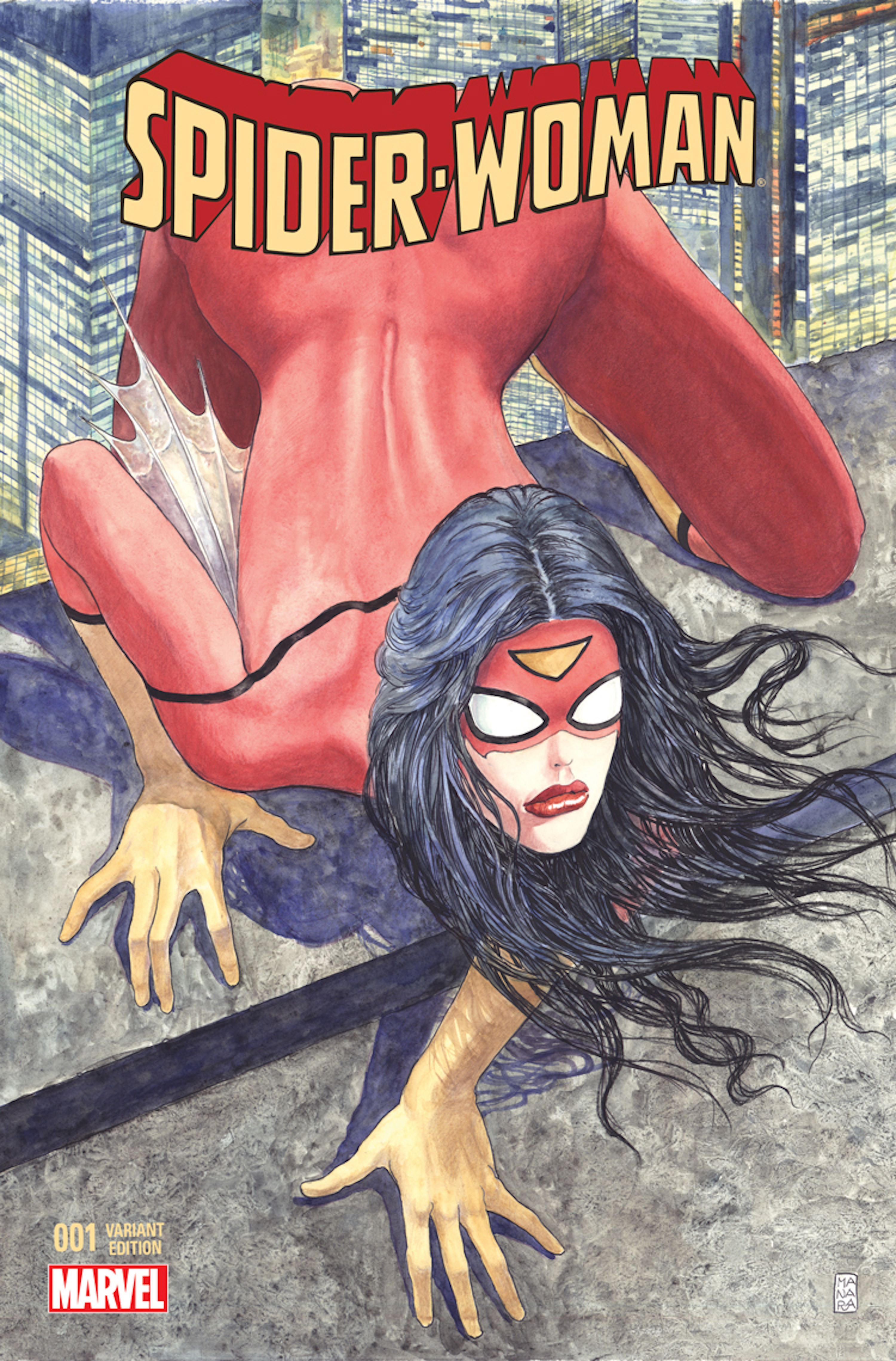
Spider-Woman’s face was not the largest issue here. Yes, they smeared red lipstick on her and gave her a sexy pout, but that certainly was not the most offensive part of this comic book cover. Understandably, Spider-Woman would be dressed in a skin-tight bodysuit; however, it’s the detailing and positioning that are overly sexualizing the character, as well as belittling her powers. She was crouched over in a sexual position that was deliberately showing off her lower half. The wording was put there for a reason, as the cover was teasing its readers.
The detailing of her back/spine were quite suggestive, showing every crevice, curve, and even the texture of her skin through the suit. While Spider-Woman looked confident, as opposed to the She-Hulk cover, both comic book covers painted these women as sensual beings that seemed like they were asking more for male attention than a genuine admiration for their superhuman abilities.
3. Face In The Shadows, Legs In The Sun
This comic book cover of Wonder Woman was particularly disheartening, as many young girls looked up to her as a role model. The only thing that Sensation Comics Featuring Wonder Woman #8 (2014-2015) taught any of those girls was to strive for impractical and unhealthy body expectations. The main focus was on Wonder Woman’s backend, legs, and bust. The sunlight coming in from the background literally highlights the character’s long legs and backside. What did the sunset do for the great Wonder Woman’s face? It put it directly into the darkness as if it was completely insignificant.
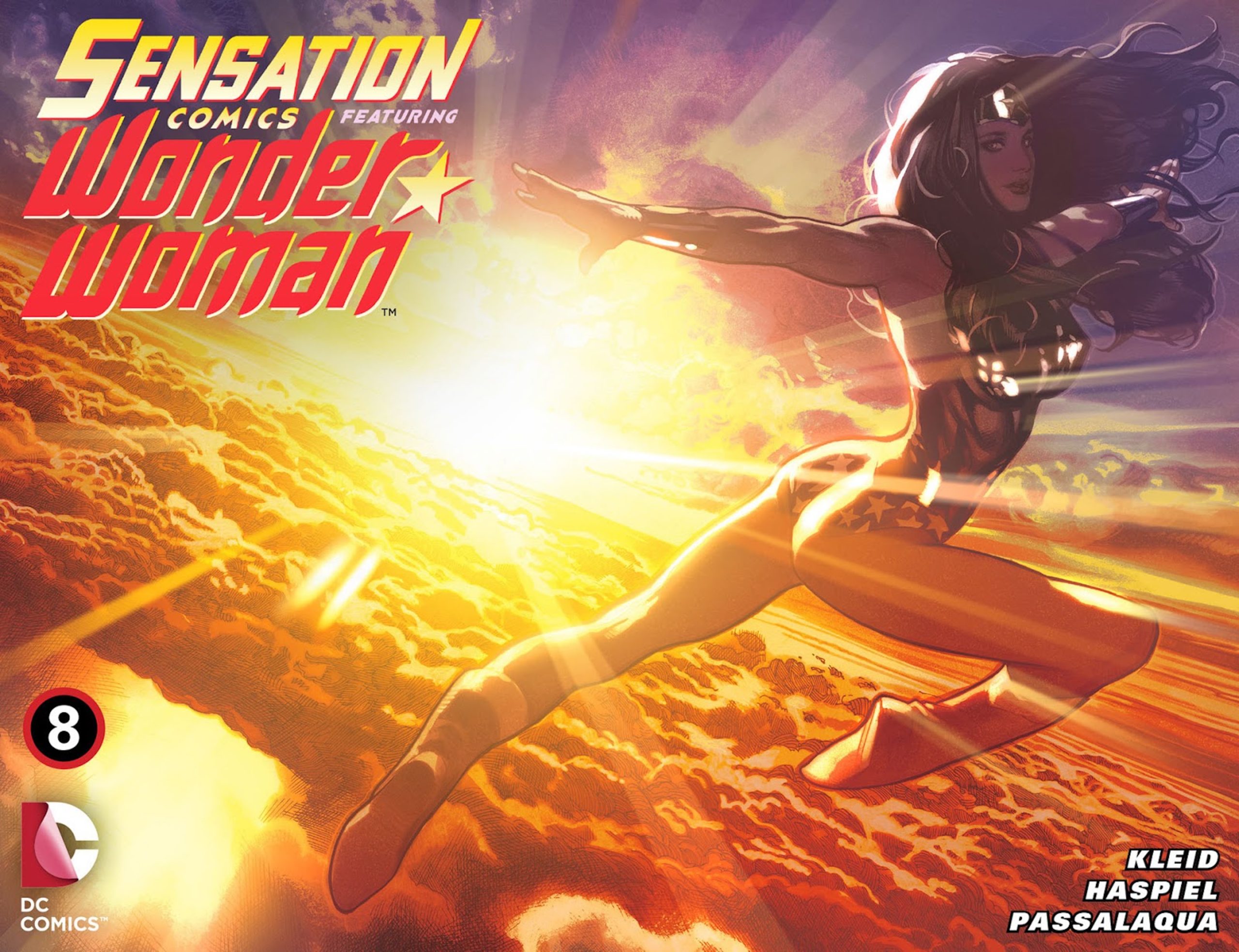
The illustration depicted not a stance of a superhero but a supermodel. Her pose was absurd in general and portrayed one of the greatest female superheroes of all time. Wonder Woman was known for being strong, resilient, and opinionated. Her brilliance and power were not advertised in any way here. (( “DC.” readdc.com, 2014. )). Of all the sexist comic book covers, this cover was painfully insulting to the character of Wonder Woman, and her entire history. Of all the kick-ass things that this woman was capable of, this illustration couldn’t have been more degrading or sexist. If you picture Batman or Superman in any of these stances shown so far, it will only further the ridiculousness of these comic book covers.
2. Her Body Is On Fire!
She was telepathic, telekinetic, and the most powerful X-Men member. It was a shame to see the all-powerful Jean Grey illustrated in such an anti-feminist and distasteful way. The only factor that the cover of Phoenix Resurrection Return Jean Grey #1 (2017) did correctly was incorporating one of her powers; conjuring fire. With that being said, what was the fire background really saying? This backdrop only made the cover look like it was attempting to make Grey look like she was “on fire” in the sexual sense.
Yes, she was completely immersed in fire, and that was a nod to her powers, but how much more provocative could this cover get? Jean’s entire outfit hugged her body and showed off completely illogical proportions. Her breasts were quite literally drawn larger than her head, and her hips and legs were positioned as if she was posing for a photo, as opposed to walking through a blazing fire! (( “Comic Book Realm.” comicbookrealm.com, 2018. ))
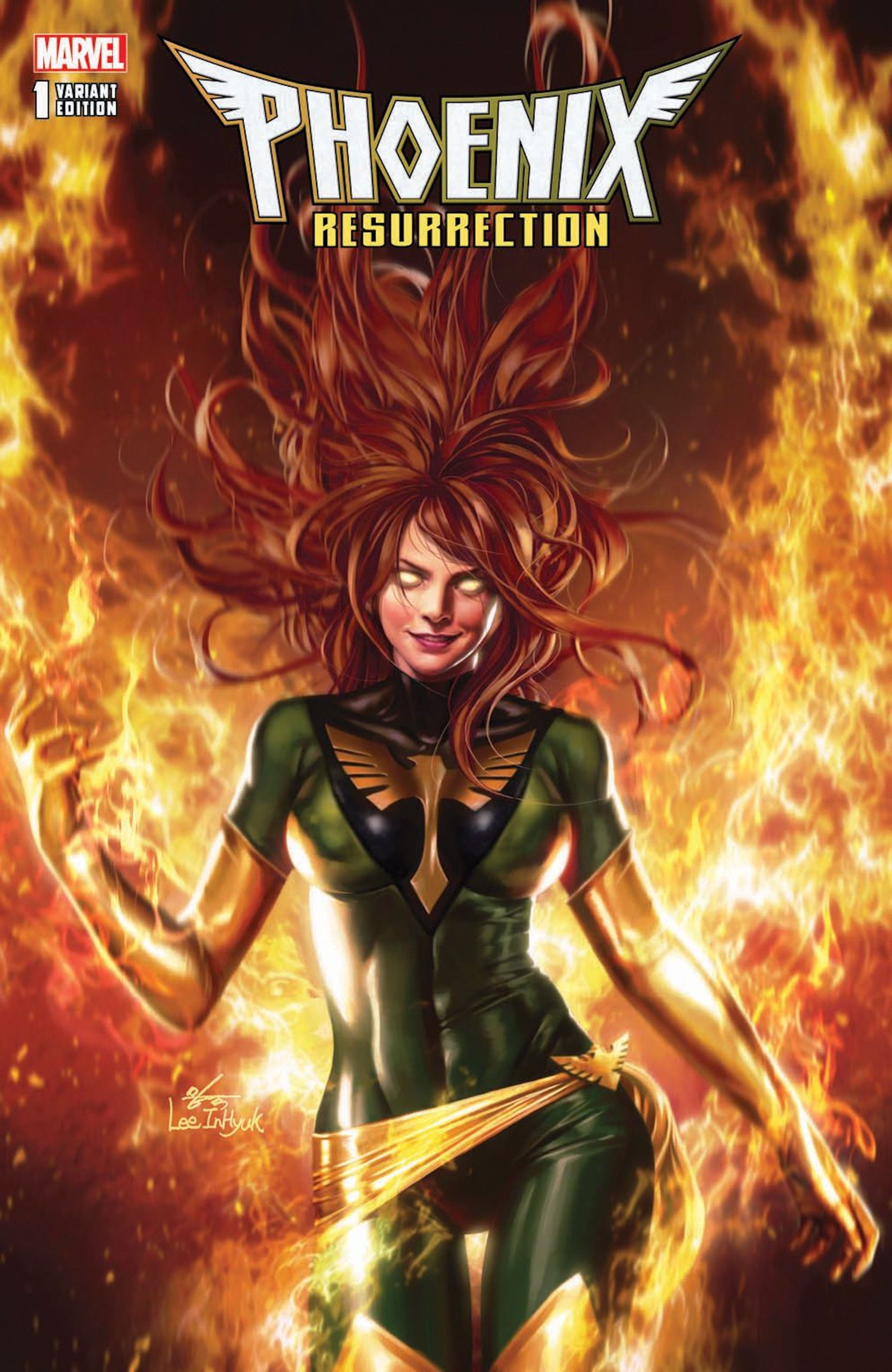
What can be approved here? She did radiate dominance by holding the flame and looking completely fearless with her commanding facial expression. However, all of that was taken away by her figure, which was purposely drawn to be the focal point of this cover. Maybe one could attempt to argue that this cover was going for a woman who could be sexy and powerful? Either way, it certainly missed the mark. Jean looks more like she is walking a runway rather than commanding authority. Comic book covers are meant to showcase warriors, but all this illustration showcases is sensualism.
1. Helpless Little Canary
Black Canary #2 (2007) had such a mixture of insulting components; it would be difficult to pick the most derogatory one. Did Black Canary look like an athlete with great physical limits? No, she looked as if a photographer had just told her to give him a sexy “roar” for a superhero photoshoot. The superhero was drawn bent over seductively sticking her rear out. Black Canary was illustrated with her hand in a clawing gesture to appear flirtatious and arousing. Everything from her perfectly waved hair to her dark, sexy makeup to her playfully angry facial expression plays a factor in how sexist this cover truly is.
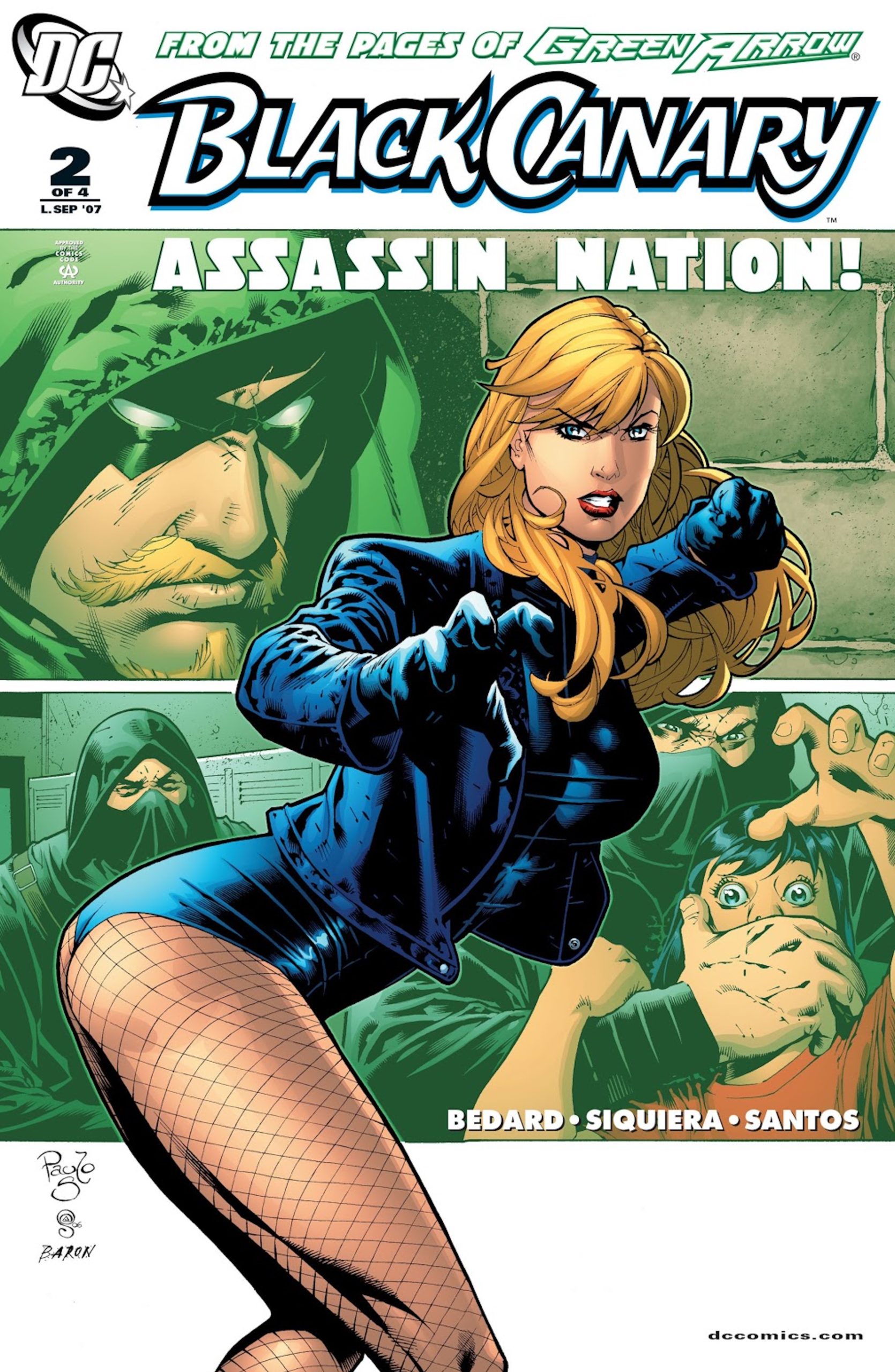
This cover was very true to the rest of the sexist comic book covers we’ve seen so far. Black Canary was drawn in fishnets, a tight, black, leather bodysuit, which revealed her large bust and tiny waist, and red lipstick. Adding to this cover’s ridiculousness, the background was extremely grave and frightening. A genuinely scary masked man was grabbing a young woman’s face to keep her from screaming. On top of that strip was Green Arrow, a famous male superhero that ended up in a relationship with Black Canary. While all of these covers are offensive, Black Canary #2 isn’t even trying to depict a strong female character. The fishnet stockings, cheeky bodysuit, and emphasis on her bust and rear brand this cover as a sexist joke. (( “Comic Vine.” comic vine.gamespot.com, 2007. ))
We Don’t Do “Realistic”
This list was no surprise, as female comic book covers have always gotten it wrong. We didn’t get to see their strengths, inner beauty, the inner fight, intelligence, etc. They weren’t kicking ass; they were posing for the camera in an uncomfortable, revealing, and overly sexualizing outfit. These female comic book covers should have celebrated and illustrated all women’s bodies, no matter what shape or size. Yes, these superheroes were drawn curvy, but the issue is, they were all drawn the same. Where was plus-sized? Where was petite? Where was athletic? These body shapes were not celebrated on these comic book covers because they were deemed “unattractive.”
These artists selected the “ideal body type” and solely focused on that angle. They served the concept of perfection. These female comic book covers were exploitive, outdated, and disrespectful. Superheroes are not perfect, so why did comic book covers try so hard to fit the mold of excellence? Flaws make a woman stand out; they make them beautiful, so let’s break the mold!