Table of Contents Show
There are several factors that can make a comic book a classic; the dialogue, characters, storyline, etc. However, one would have to read through to analyze all of those components. So, what makes someone want to read a comic book simply from the cover art? Comic book covers are a tremendously significant aspect of comic storytelling. Infinite covers are created, but only a fraction contains the most cherished comic book covers of all time.
The artwork must be eye-catching; have shock value. This could relate to controversy, drawing style, character action, composition, and so on. Auctioned off, kept inside a glass case, passed down from generation to generation; comics are widely treasured by fans. Let’s dig into some of the most imaginative and world-shattering cover art ever created and, the brilliant artist’s behind them! (( “Watch Mojo.” Watchmojo.com, 2018. ))
Spider-Man No More!
The fantastically dramatic comic book cover of The Amazing Spider-Man #50 (1967), designed by the famous John Romita Sr., tells a story all on its own. Peter Parker is shown walking away from Spider-Man, which has already peaked the reader’s attention. It appears as if Parker and his alter-ego are splitting in two. The cover raises questions: Why is Parker walking away from his superhero life? Is this the end of Spider-Man? One would have to open the book in order to find out.
John Romita Sr. has created numerous Spider-Man comic book covers. He is known for his use of bright colors, theatrical character positioning, and intense emotion. While numerous Romita-designed covers exude complexity and energy, The Amazing Spider-Man #50 took a different stance. This cover is not overly complicated, yet it still has that Romita touch to it. The use of color is truly stunning, vibrant, and contrasting. The dark red vignette creates numerous shadows and an ominous tone. Parker seems as though he’s walking away from his superhero double-life and into a black hole.
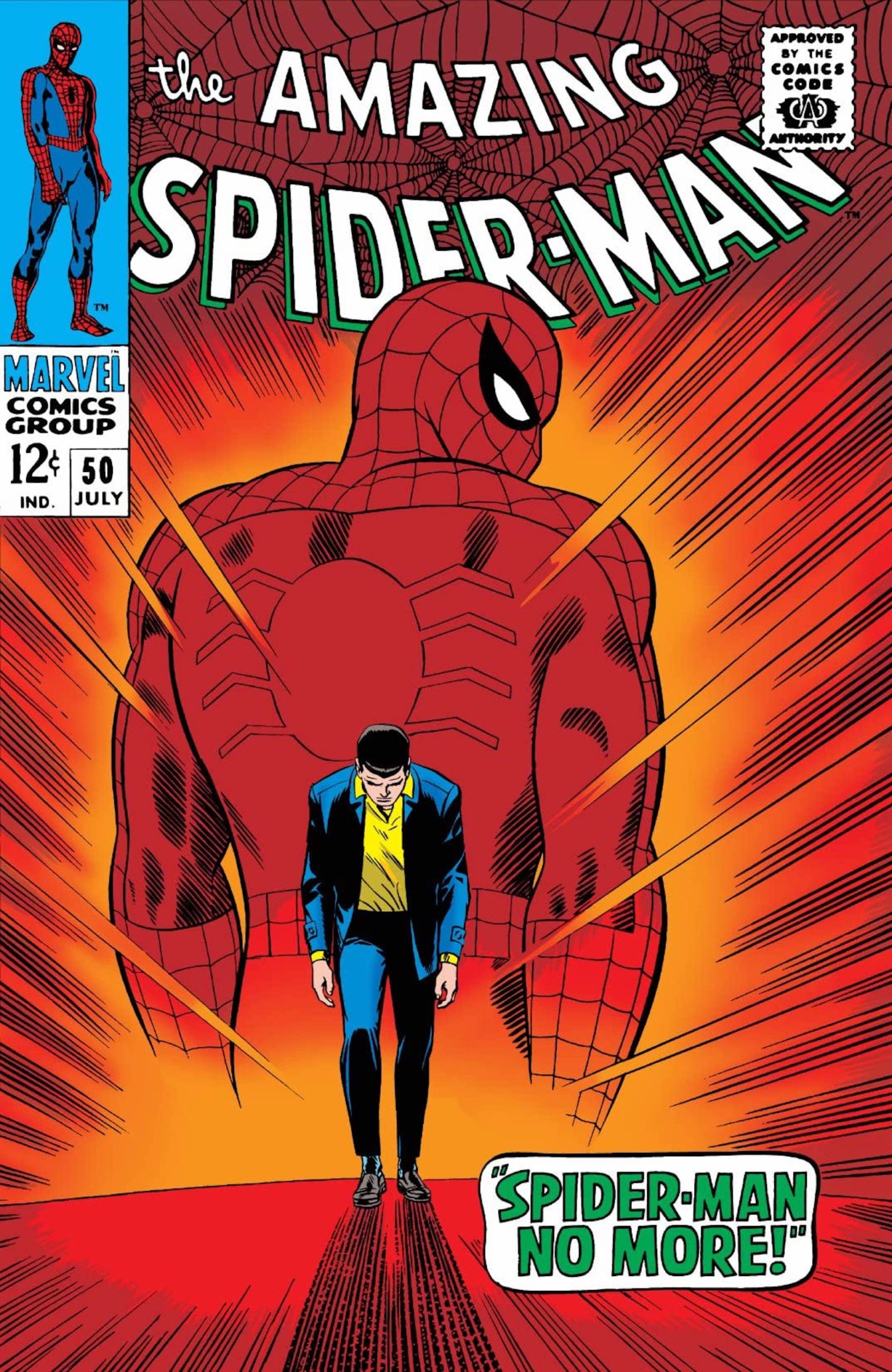
Romita’s Spider-Man comic book covers traditionally showcase Spider-Man trapped in battle, or jumping out at the reader. This cover is significant because it’s divergent from the others. Parker’s head is facing down, revealing that he’s feeling depleted and, Spider-Man’s looking back at Parker, portraying a look of disappointment. Even a reader who’s never opened a Spider-Man comic would see this cover and think, huh, this guy is walking away from being a superhero?
That’s interesting. “Spider-Man No More!” is most certainly the most eye-catching wording on the cover. The sizing of the word bubble is illustrated to be just as significant as Parker himself. This factor is meant to create curiosity and peak interest. So, how does this cover reflect the comic storyline?
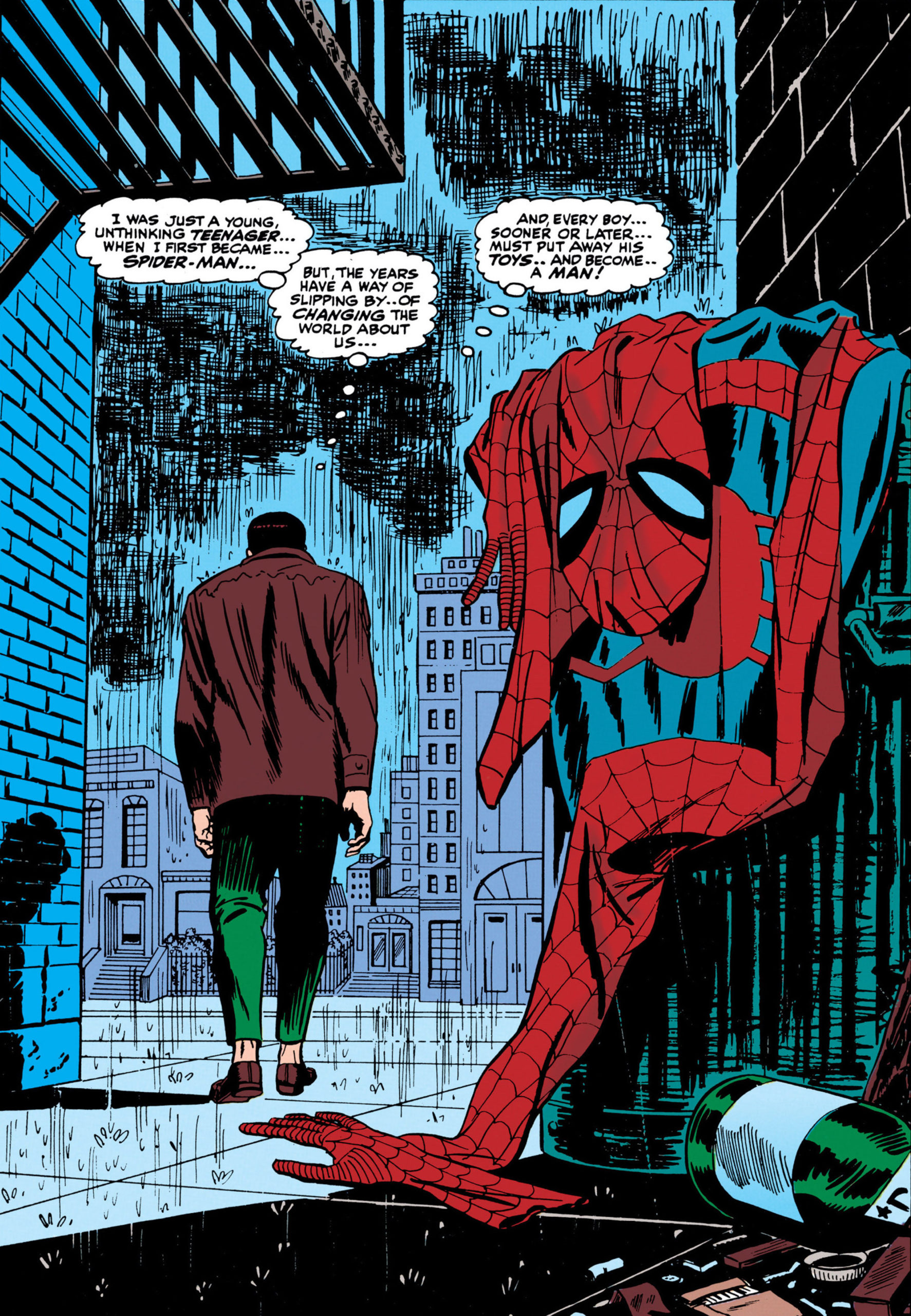
In this issue, Peter beat himself up over not being there for his sick Aunt May, in her time of need. During May’s time in the hospital, Peter crumbled under the pressure of school, the world and, his friends and family. He decided to literally throw his Super-Man outfit into the garbage. Eventually, nearing the end of the comic, Peter’s Spidey instincts pushed him to save a man who reminded him of his late Uncle Ben. This moment was what woke Peter up from his Spider-Man hibernation and caused him to reclaim his renowned superhero title.
This cover art is deeply special and timeless. It’s rare to see comic book covers where the superhero is choosing to walk away from his true calling. Spider-Man is one of the most favored and idolized symbols in comic history, so to have a cover where such a beloved superhero is saying goodbye to his heroism, that’s bound to evoke major outrage and concern from fans. (( “Fandom.” Marvel.fandom.com, 2020. ))
Thirty Days
Created by Dave Johnson, the charmingly classic cover of Detective Comics Vol 1. #761 (2001) truly catches the eye. Comic book covers are typically known for their colorful and busy nature, but “In Thirty Days” paints a completely original picture. The fact that this cover went on to be so praised just goes to show that the artwork does not need to be overly flashy in order to stand out. One might ask, how can a cover so minimalistic become so monumental? That’s just it; the complexity lies within the simplicity. (( “The Daily Fandom.” Thedailyfandom.org, 2020. ))
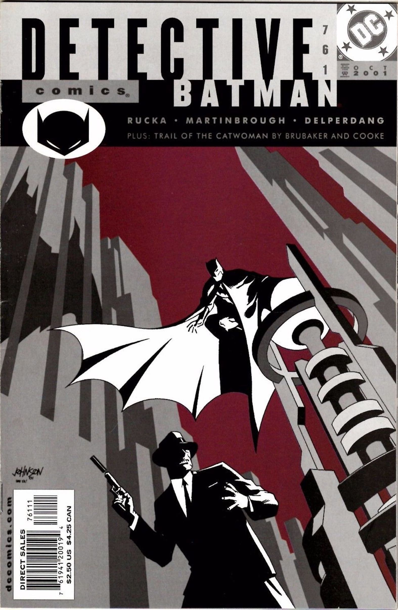
Dave Johnson is known for creating extravagant film noir comic book covers. This artist is also famous for his use of black, white, and, red. “In Thirty Days” reflects Johnson’s classic style, showcasing superheroes in their best light with a dark tone. This cover goes against the grain by utilizing a gray color palette with a solid dark red background. The artwork does not give away many details about the story inside, but it lets the reader know that it’s going to give them exactly what they’re signing up for; Batman kicking ass, as usual.
Johnson’s comic book covers are usually hypnagogic and confusing to the eye. Detective Comics Vol 1. #761 is appreciated because Johnson pulled back on his surrealist style, in order to keep the focus on a more traditional depiction of Batman. Be that as it may, this artist did not need to sacrifice one bit of his theme, creativity and approach, to design this timeless cover.
In this comic, Sasha Bordeaux, Batman’s bodyguard, was given one month to prove herself useful to him. Despite the fact that she was aware of his true identity, Batman fearlessly stated that she would be fired if she could not succeed in her tasks. There was some action between Internal Affairs’ Inspector Esperanza, the Mad Hatter, and Jordan Reynolds’ death, but in the end, the main focus stayed on Bordeaux’s capability. Sasha ultimately convinced Batman that she was loyal and qualified. (( “Fandom.” Dc.fandom.com, 2020. ))
My Destiny Lies In The Stars!
Behold, The Uncanny X-Men #135 (1980), an extraordinarily impressive cover by the great John Byrne. This artwork shows one of the most popular X-Men members, Jean Grey, crumbling the X-Men logo to pieces. This was truly a sight no fan thought they would ever witness. To add to the shock value, the rest of the X-Men team members are beaten and bruised in the midst of her destruction. The wording: “Defeated by Dark Phoenix!” is right on the nose with this storyline. Every aspect from facial expressions to foreshadowing makes this cover remarkable. (( “Scans_Daily.” Scans-daily.dreamwidth.org, 2016. ))
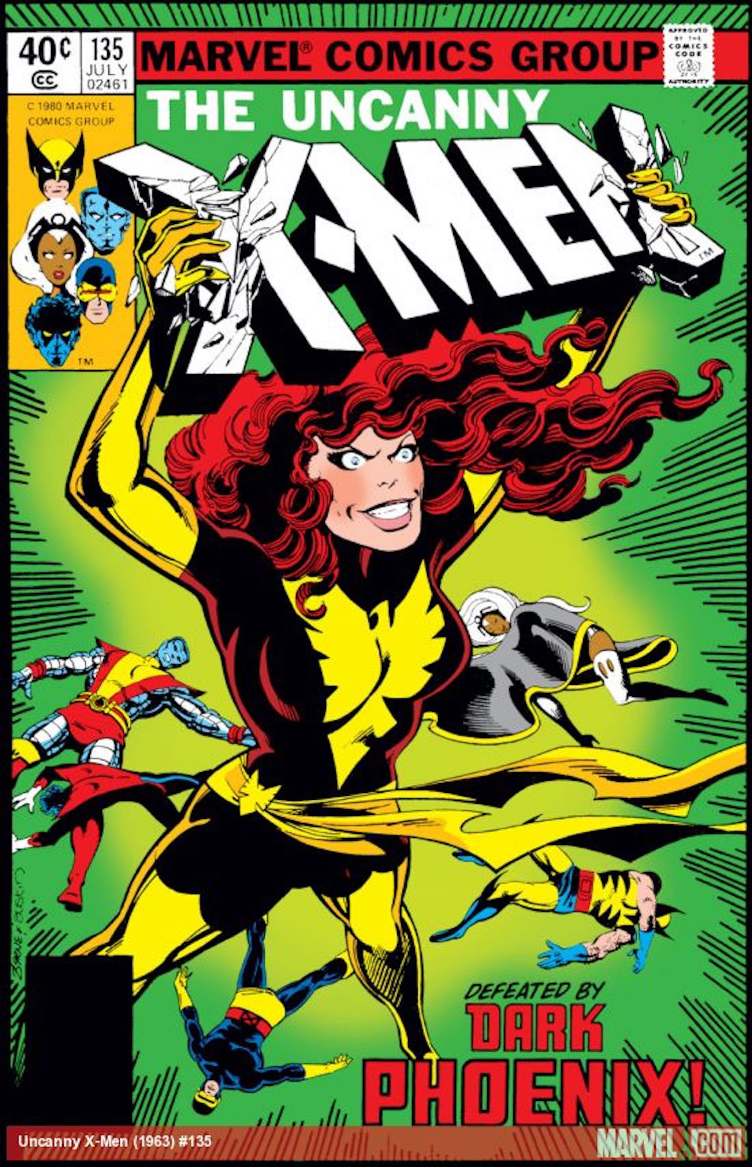
John Byrne is widely known for his comic book covers. This cover embodies everything Byrne; a full range of colors, several characters displayed and, extreme action. Byrne’s covers encompass everything “superhero;” Superman saving Wonder Woman, Captain America beating the villain, The Hulk demonstrating his strength, etc. Typically, Byrne would illustrate Jean Grey in an honorable light. The Uncanny X-Men #135 goes against Byrne’s traditional style by displaying a superhero as a villain.
The issue portrays an entirely new Jean grey under the power of the Dark Phoenix. In the comic, Mastermind killed the psychic image of Cyclops, Grey’s longtime love. This action led to Jean’s breakdown and transition to “Dark Phoenix.” Jean leaves her old identity behind and goes to battle with the X-Men, before fleeing the planet and going on a bloodshed rampage.
After returning home, Jean defeated the X-Men in war, once more. Charles Xavier was finally able to get through to Jean and turn her back to normal, but not for long. Jean internally battled her Dark Phoenix side until it conclusively got the best of her. The X-Men were repeatedly forced to go against one of their own, a fight that shook readers everywhere. In the end, Jean turned to suicide as her last resort. Her sacrifice will always live on through this comic.
“Jean Grey could have lived to become a god. But it was more important to her that she die…a human.”
– Uatu
Own Worst Enemy
The Iron Man Vol 1. #128 (1979) cover, designed by Bob Layton, wins the most beautifully detailed “mid-life crisis” comic book cover ever created. In all seriousness, this cover has made the cut for multiple reasons. Comic book covers traditionally depict the superhero in the most heroic light possible and, not that Tony Stark looks awful here, but… well, yeah, he does look pretty pathetic. However, that’s the point of this entire comic! Stark is supposed to look like he’s completely out of control, that’s what’s so intriguing about this artwork. (( “Fandom.” Marvel.fandom.com, 2020. ))
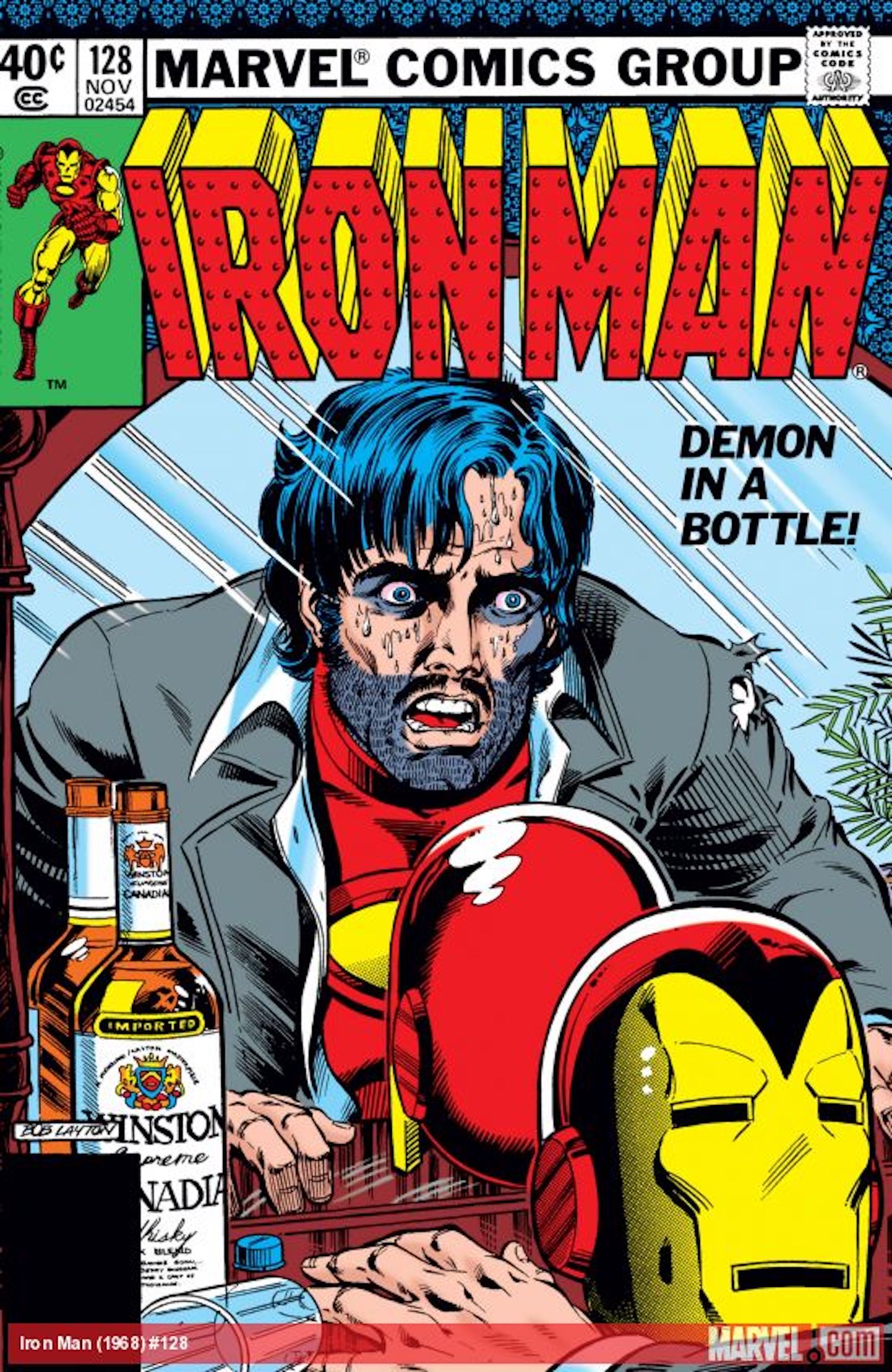
“Demon in a bottle” is clearly referring to Stark’s struggle with alcohol, which is also evident through his terribly disheveled new look. Tony stares at himself in the mirror, contemplating, with a bottle of liquor on one side and the Iron Man helmet on the other. This imagery symbolizes how Stark cannot have the best of both worlds; he must make a decision. Is he strong enough to overcome his addiction? As much as this cover gives away the plot, reading the comic is the only way to know if Stark wins this battle.
Bob Layton has produced numerous Iron Man comic book covers. For practically everyone, Iron Man is presented as strong, in control, and, a savior. On Layton’s Iron Man cover, the artwork surrounds the superhero. The cover of Iron Man Vol 1. #128 sticks to that same formula. Iron Man is still the main focus, however, this time Layton is advertising the character as weak and undependable. Layton’s use of Iron Man’s iconic colors and details is consistent, but this cover is powerful for going against everything that Iron Man is supposed to represent.
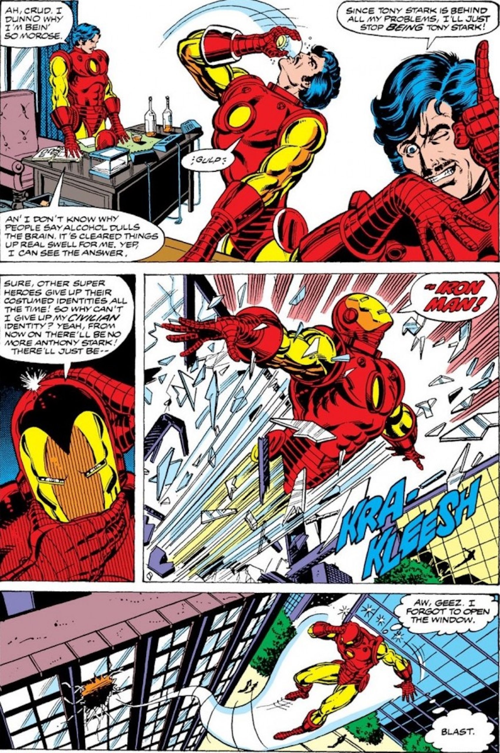
The issue began with Stark ranting about how chaotic his life had been and attempting to drink his problems away. He continuously humiliated himself, trying to save the day like a drunken fool. Stark eventually met Bethany Cabe, a woman who had lost her husband to addiction. Through a messy series of events, Bethany showed Tony that he could overcome any obstacles in his way. With Bethany’s aid, Tony decided that he would be the only one to decide his fate. (( “Comics Misremembered.” Comicsmisremembered.com, 2020. ))
Something From Beyond The Grave
Avengers Vol. 1 #57 (1968) cover showcases the first appearance of Vision’s character. Created by John Buscema, this extraordinary cover utilizes color in such a unique way. Using mainly red and black, the artist was able to design an extremely multi-dimensional image. Buscema typically utilizes a variety of color and takes his time on facial expressions. The artist’s comic book covers always immensely reflect the storyline, as well. With this cover of Vision, Buscema’s touch is present, yet controlled.
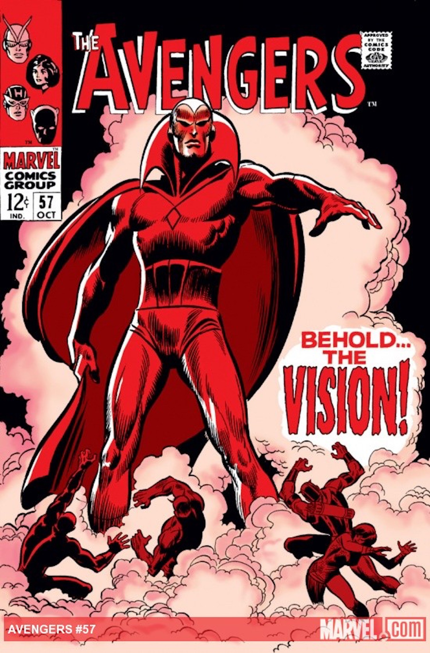
Buscema’s comic book covers are usually quite vivid and colorful. While the artist did not go to town on the color scheme, he did leave his signature mark with intense emotion on Vision’s face and, the storyline foreshadowed. “Behold… The Vision!” is quite a powerful statement to display. It’s evident that the comic revolves around a new character, but it is deeply inquiring; Does Vision belong to the dark side? (( “Comic Vine.” Comicvine.gamespot.com, 2020. ))
In this comic, Vision was found collapsed at the Avengers Headquarters. He was examined by the Avengers team but attacked them before they could figure out exactly who he was and what was wrong with him. Vision eventually calmed down enough to notify the Avengers team that Ultron-5 was programmed and sent him to demolish them. After Vision and the rest of the Avengers discovered Ultron in his lair, Vision battled him to victory, saving the team and proving his loyalty. After this comic, Vision officially became part of the Avengers gang.
I Will Miss You Forever
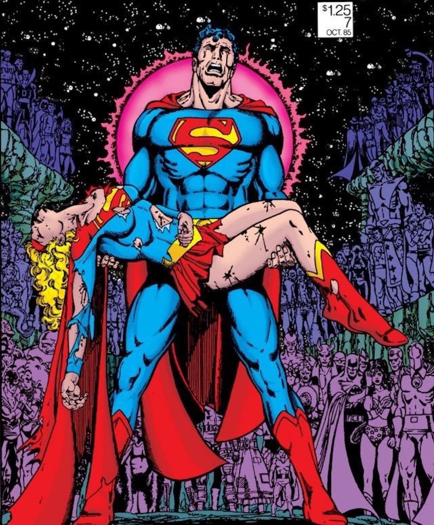
George Pérez’s Crisis on Infinite Earths Vol. 1 #7 (1985) cover has gone down as one of the most shocking and earth-shattering comic covers to ever exist. Superman has always been depicted as powerful, graceful, and fearless. On the cover, the superhero is seen devastated and hysterical, holding a presumably dead Supergirl in his arms. Superman and Supergirl are at the forefront of this cover, but the background is immensely significant, as well. Behind these two characters, it appears that every DC character is present. So, what does the reader get from this cover? It’s clear that Supergirl is gravely injured, Superman is a wreck and, all of the DC Universe is present; could this really be a funeral?
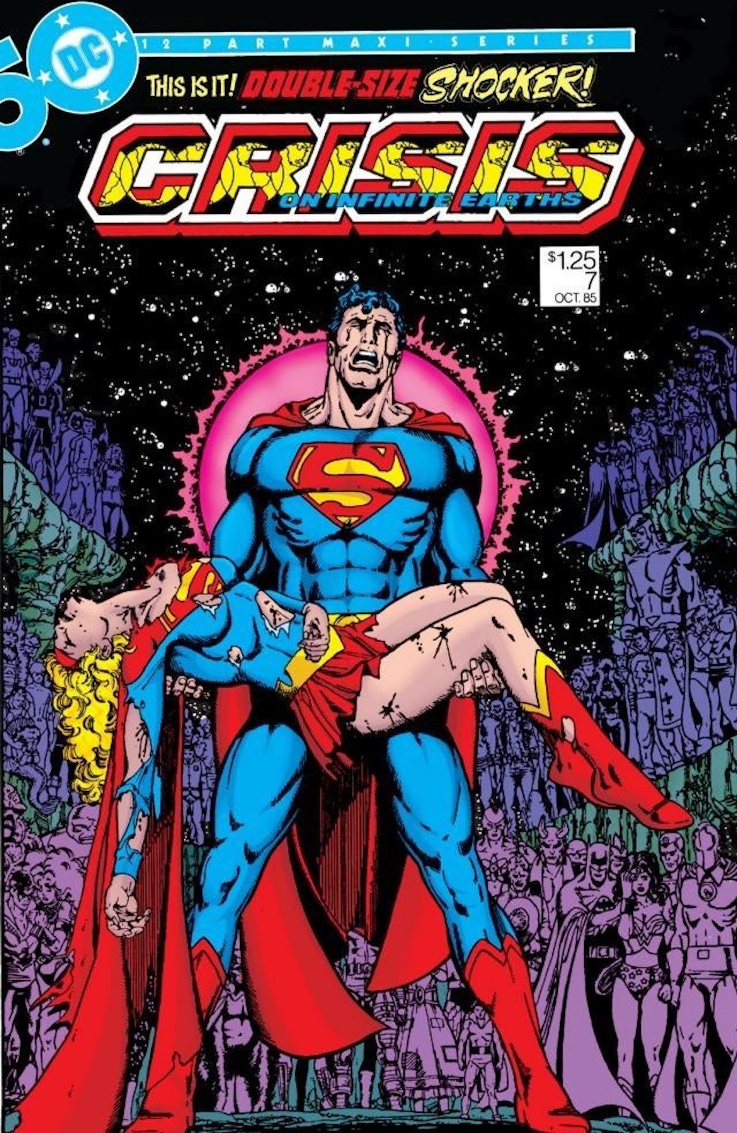
Let’s take a look at each character’s emotions. Supergirl is lifeless, Superman is shattered, Batman can even be seen on the right side, comforting a heartbroken Wonder Woman. How on Earth could anyone see this cover and not read how this catastrophe occurred?! Every part of this artwork is compelling and captivating.
George Pérez is known for his influential and extraordinary comic book covers. Pérez gained an enormous fanbase for his brilliant and electric artwork that brought characters to life. His work is fascinating, mainly incorporating several characters, an explosion of movement, an unmatched color scheme and boldness. With each Pérez creation it’s almost difficult to find a focal point, as he rarely leaves negative space. Crisis on Infinite Earths Vol. 1 #7 is no exception to this rule. While Superman and Supergirl may seem as if they are the main focus and, very well maybe, it is up for debate due to the impressive DC crowd.
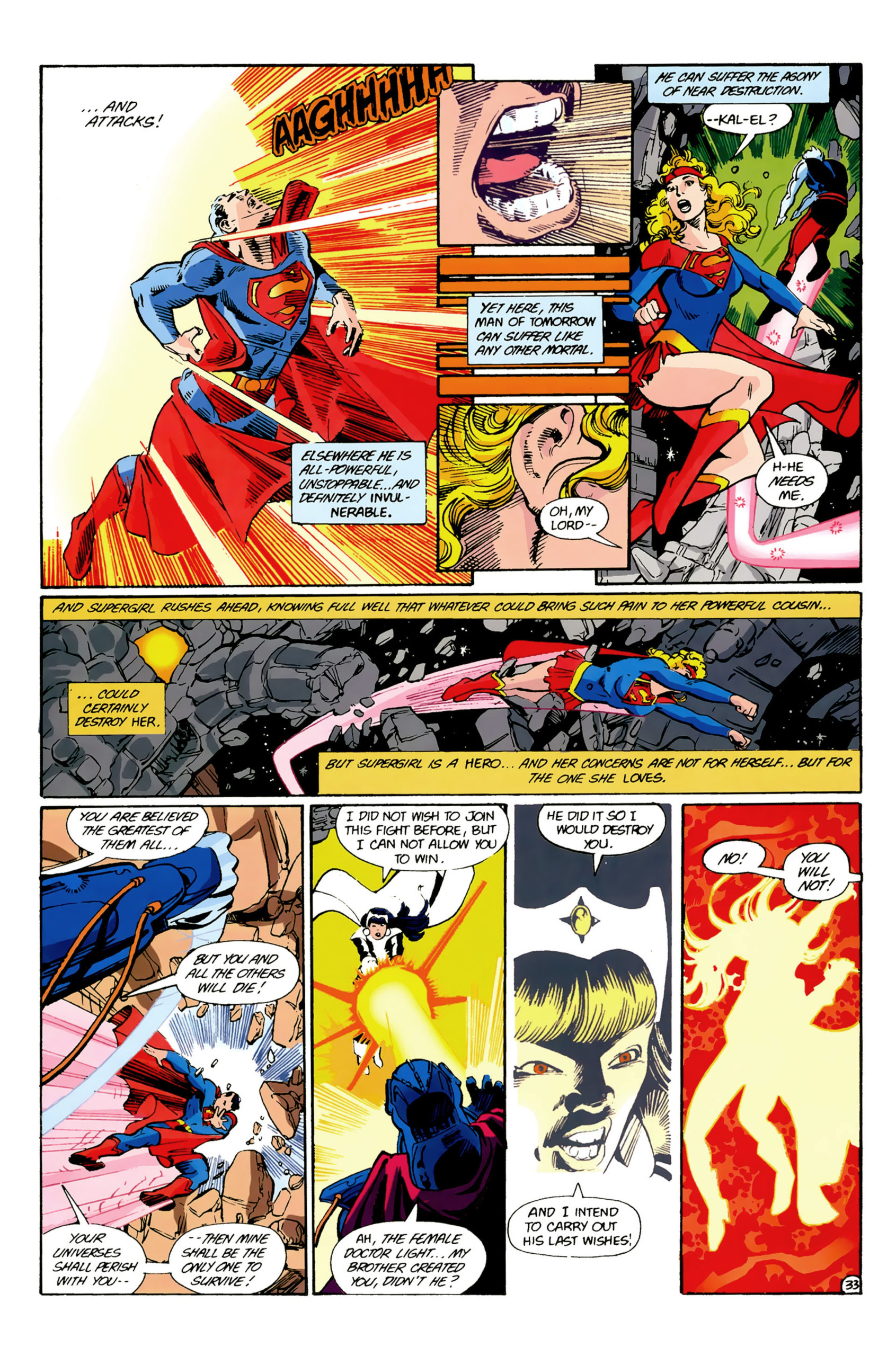
In this issue, heroes from all five Earths went to battle. As the Earths began to merge, Superman was at the forefront of the war. Supergirl ran to his aid as he fought against Anti-Monitor. Just as Anti-Monitor was about to destroy Superman, Supergirl threw herself in front of him, taking the hit. She became severely weak from the blasts, but still continued fighting. (( “Fandom.” Dc.fandom.com, 2020. )). Supergirl pushed her cousin out of the way, saving his life. In the end, Anti-Monitor caught Supergirl off guard and sent a titanic energy burst throughout her body.
Superman held his cousin in his arms as he begged her to live. The cover showcases Superman crying for reprisals as Supergirl dies in his arms. It was revealed that the background of the cover illustrates Supergirl’s memorial that was held shortly after her death. The number of characters illustrated made it one of the most famous memorials of all time. The comic ends with Superman peacefully releasing Supergirl into space.
The Power Of Comic Art
Of course, this list does not contain the only influential and honorable covers. There are certainly several comic book covers that could have made the cut. However, these specific covers are each rare, original, and exceptional in their own way, just like the artist’s who created them.
It’s evident that each of these comic book covers demonstrate phenomenal artwork and storytelling abilities. At the end of the day, readers will always have to scan the pages in order to find out if a comic is up to par, but when the cover art and story are both unprecedented… now that’s the definition of iconic.