Table of Contents Show
Color is a wonderful thing that often shapes how we perceive items in everyday life. In the film industry, creatives, including editors, directors, and designers, utilize color to drive their audience in a certain emotional or plot-based direction. Although it may be missed upon initial viewing, minute color details can have the biggest impact on the perception of characters and tone of a movie.
Take the triadic color palette of Todd Phillips’ Joker, for instance, which insinuates the sinister feeling of a nightmarish circus as he descends into madness. Or the black and white of Greta Gerwig‘s Frances Ha, which forces the viewer to center more on the action and dialog of the film to grasp the intensity and stakes.
Like these filmmakers, Sofia Coppola also uses the color palette of her movies to her advantage. Unlike them, however, the vibrant hues tend to be the central player of her exceptional pieces, rather than a supporting member of the cast. Within her movies, Sofia Coppola’s color palettes drive the emotional center and tone of the story and push the audience deep into the minds and realities of relatable characters.
Sofia Coppola: Personal Filmmaking
To understand Sofia Coppola’s unique obsession with color, it’s first important to become familiar with the types of movies she makes. Unlike her father, the esteemed Francis Ford Coppola, Sofia’s films aren’t so much intensity or action reliant as they are people-based. She really likes to dig into the core of humanity, with folks such as the unfortunate Marie Antoinette in Marie Antoinette, or the tragic Lisbon girls in The Virgin Suicides. Her films are incredibly personal, so her colors reflect the internal rather than the external. She also “[employs] much less dialog in her films than other filmmakers” (( Renee )), which puts extreme emphasis on how it looks.
Whatever Sofia Coppola makes, the characters have been fleshed out and displayed in all their glory before the audience. We know exactly who they are, which brings us closer to the story.
Color As A Tool In Storytelling
In movies, it can be hard to depict how certain characters feel. Films aren’t like books, where the internal conflict can just be written out in words. Some directors choose to use physical movement to express the inside. Others utilize voice-over or dialog. Sofia Coppola, instead, uses “visual codes [that serve] to reflect the emotional journeys of her protagonists” (( Woodward. )).
The very first color we see onscreen sets the overall emotional tone for the movie. It let’s us understand what kind of state the main character is in right off the bat and prepares us to connect on a deeper level. The way that Coppola is able to communicate so much through a simple color makes her films that much more fantastic. The audience is unknowingly drawn into the sensation, rather than being bored by words. It’s something incredibly hard to do, yet her precision is immaculate.
Color as a tool isn’t uncommon: filmmakers like Wes Anderson, Edgar Wright, and David Lynch have long utilized color to exemplify an esthetic. However, Coppola’s method of encapsulating an entire mood within one shade is unique. It could have come off as cheesy or ugly, but instead, it raises the story to new heights.
The Virgin Suicides
The Virgin Suicides is one of the best examples of Sofia Coppola’s depiction of inner turmoil through color. In order to do this, she combines three very distinct hues and contrasts them throughout the film.
As we begin, we are introduced to all five Lisbon sisters. Although we get to see all of their lives play out, the main two we experience the story through are thirteen-year-old Cecilia and fourteen-year-old Lux. We go through their ups and downs, and eventually end with their untimely deaths.
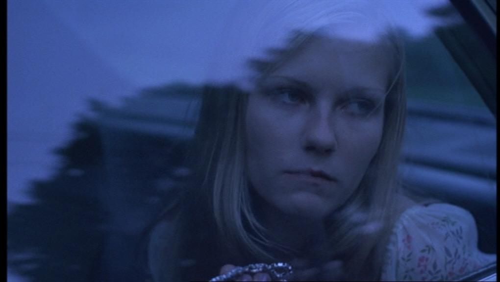
We do see Lux and Cecilia’s inner conflict through dialogue, but the most telling feature of this issue is the color of the film. When bad things are happening, Sofia Coppola chooses to utilize blue hues. Blue is a color associated with sadness, disappointment, and despair. When we see blue, we know what’s coming. Lux’s white dress quickly went from a beam of radiant light to the tinged blue of a fallen angel.
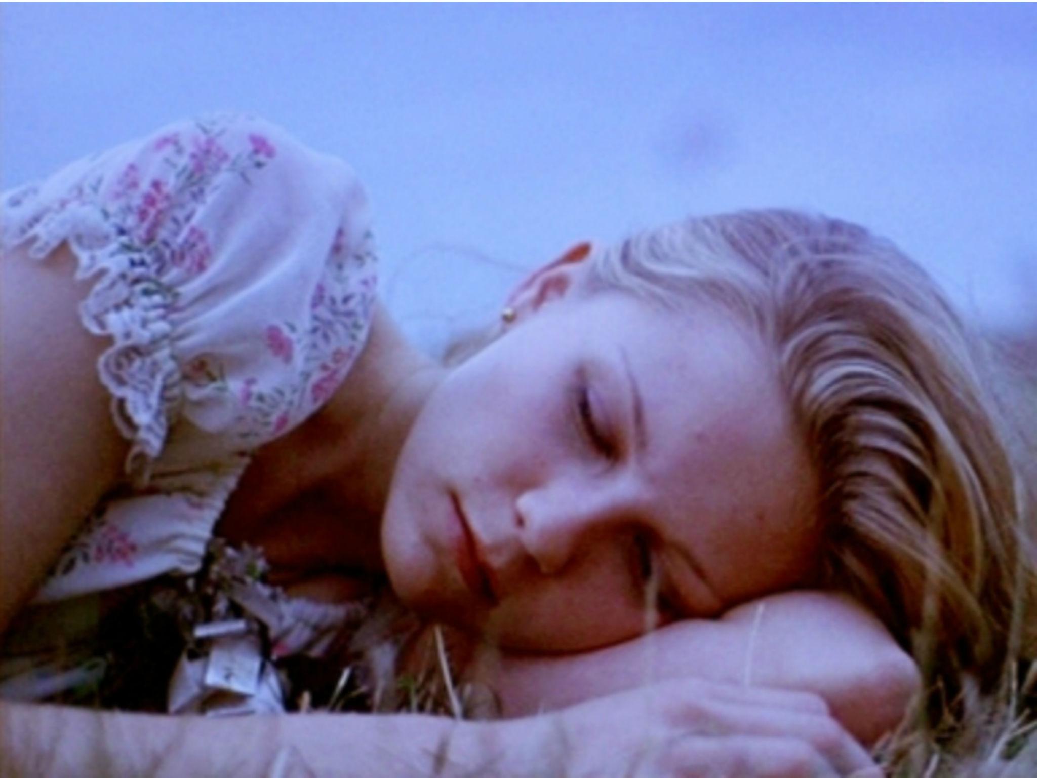
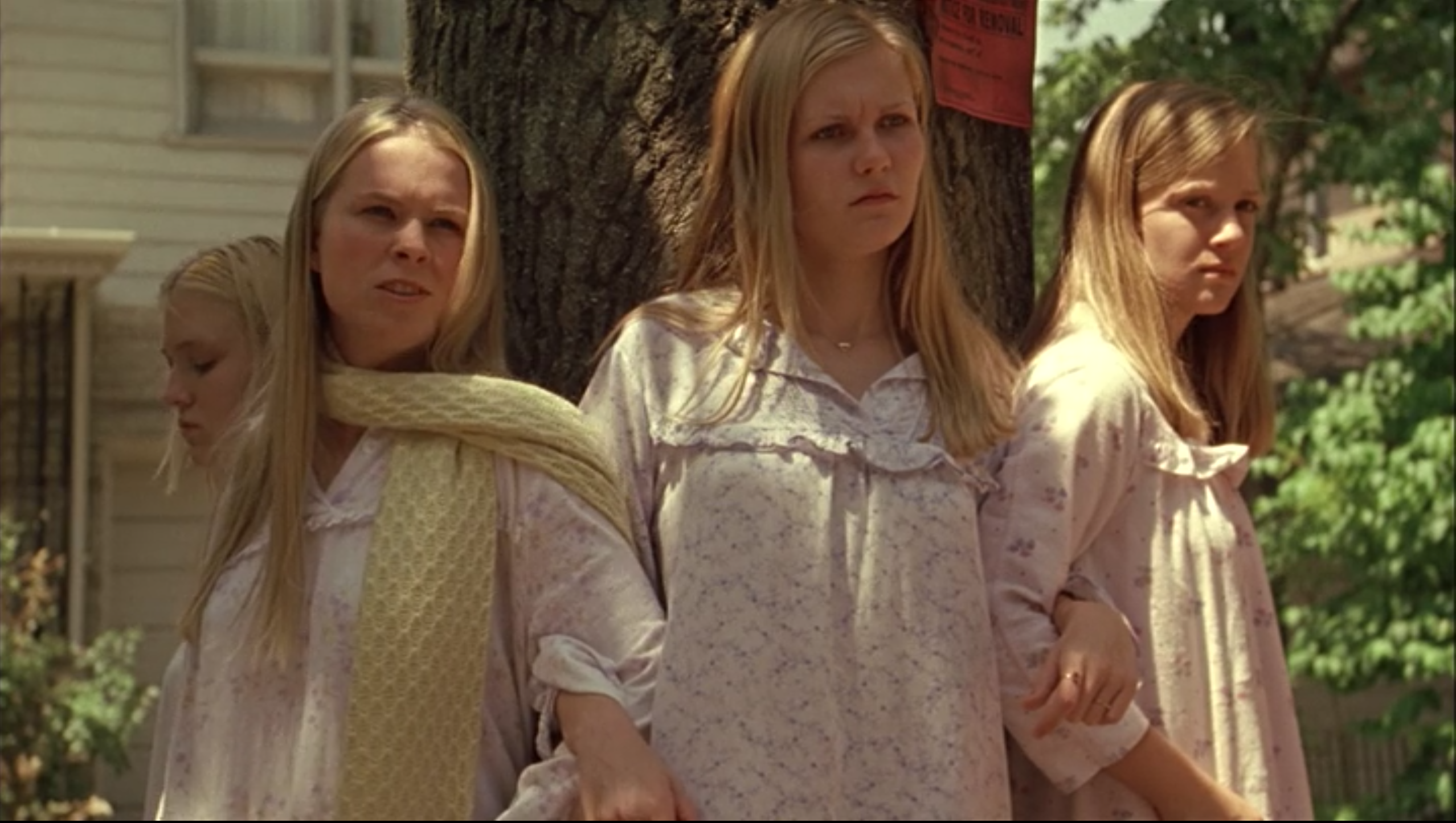
In wild contrast to that, Coppola uses pinks and whites to show rare moments of false joy for the Lisbons. When they are supposed to be happy, their world is bathed in light. They come across as porcelain dolls, and the viewers are placed into a false sense of ease. Thus, the finale of the movie comes as a shock.
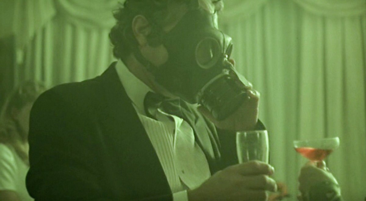
After the deaths of all five sisters, the movie shifts to a putrid green hue. This represents “the rot of the Lisbon girls taking hold” (( Clark )). Green represents the despair and loneliness that was left behind in the wake of the tragedy. By the end, we’ve felt the pain of the Lisbon girls and the wide hole that is left after their departure. It’s not easy to look at, and in turn, we feel the disgust that the townspeople must feel. We are a part of the movie.
Lost In Translation
In her Oscar-winning film, Lost In Translation, Sofia Coppola this time uses her palette to represent the muted and downtrodden state of the two main players.
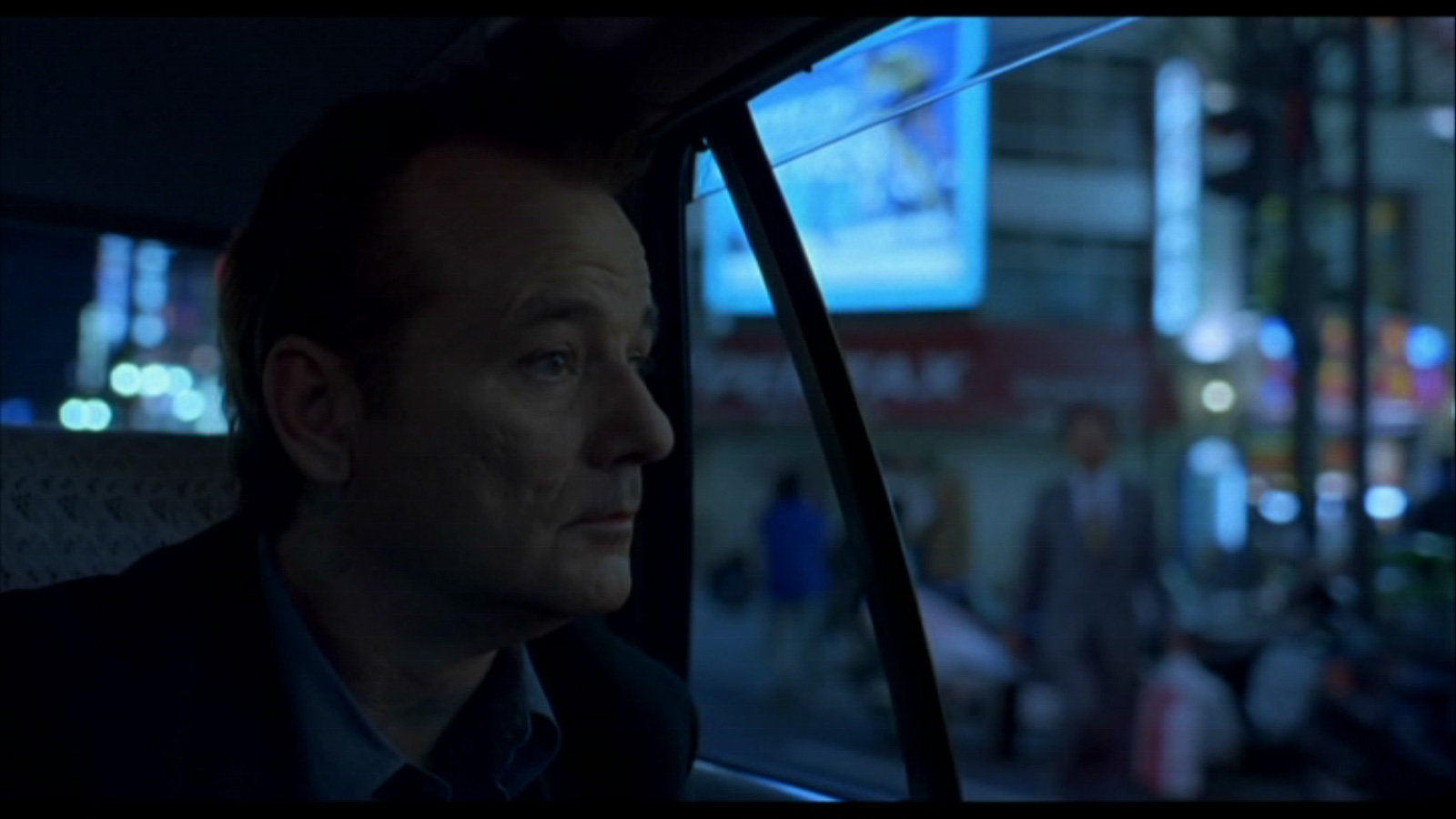
We begin with browns, yellows, and blues, colors that seem distant and lonely and far off. The characters don’t know each other very well, and they are both in states of “decay” in their own personal lives. In this case, the color represents their relationships with both each other and themselves.
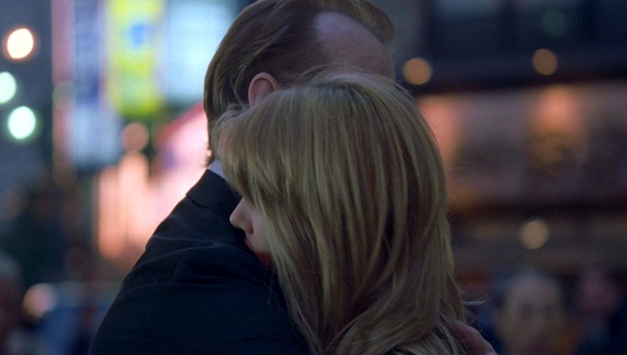
As the movie goes on, the characters grow closer. They give each other hope and a purpose, and thus the colors shift to reflect that. From earthy tones, the film is introduced to floral colors: greens, pinks, blues. It allows us to confirm that the protagonists have finally decided to give life a go one more time. We’ve been rooting for them, and we finally get to see them begin to blossom and open up into a new, colorful world.
Marie Antoinette
Marie Antoinette is a film about a naïve young adult who is handed way too much money and way too much power. The colors reflect that and allow us to connect with a girl that would otherwise be a bit of a despicable character.
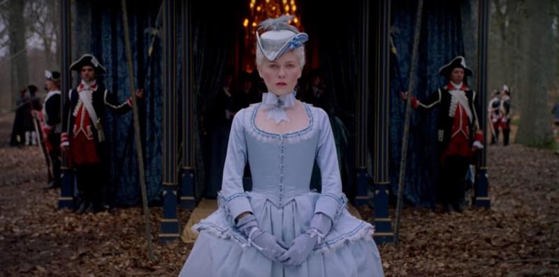
At the beginning of the movie, Marie is shown being driven to her new life in a black carriage. She is dressed in blue, it’s cloudy, and the woods beyond are nothing but dark browns and faded greens. Her world is full of uncertainty, and we are drawn into her fear and sadness through the cool tones. This is a girl being pushed into something she is utterly unfamiliar with. It’s something we’ve all been able to relate to at some point in our lives. Subconsciously, the blues are tapping into that inner fear.
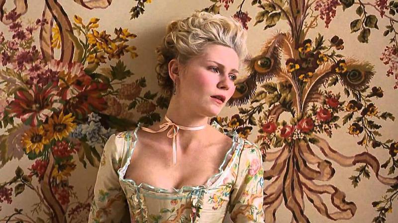
As Marie is introduced to her new life, the colors quickly shift to a gorgeous pastel palette. We see her luxurious dresses, the palace, and the foods she eats. It’s full of color that drips with luxury and wealth. We understand that Marie is hypnotized by all that she has, and she uses it all for herself (as most teenagers would). We, too, become like Marie, infatuated with this brand new world.
Just as quickly as the colors appeared, they were snatched away. We empathize with Marie as she is ripped from her dream world and thrust back into the black carriage that brought her here, now taking her away. It’s a consequence of her poor actions. We understand that she was just a young adult placed into a world of color that she wasn’t ready for.
The way that the colors intermingle with the clothing and set pieces of this film really pushes the dramatic and intense emotion home. Not only is it just a tint or a hue, but the color is pushed into literally everything. Clothes, shoes, wallpaper, beds, and even the food boast pastel greens, pinks, yellows, and blues. The emotion is clear, and the audience is attracted to bright colors. Like moths to a flame, viewers are drawn to the immaculate detailing.
The Beguiled
The Beguiled let us know right away that we are dealing with something tangled, something dark and mysterious. We open on a girl walking down a long, dark dirt road covered in tall, arched branches. As if this isn’t mysterious enough, Sofia Coppola successfully uses color to let us know how we’re supposed to feel.
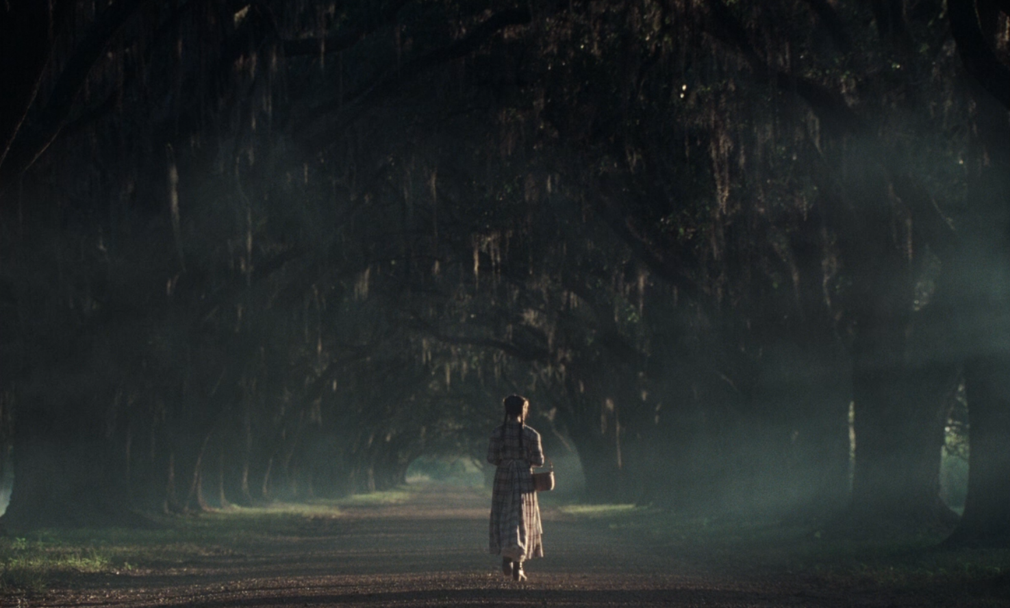
Green is a double-sided hue. On one hand, it can represent life, safety, and growth. On the other hand, it can symbolize greed, jealousy, and ambition. It’s a backstabbing kind of color. Mixed with the ominous light and the brows of the trees, Coppola tells the audience to put their guard up. We can connect to the characters, but only so much. Everything is not as it seems. According to Coppola, she selected her colors because she “wanted it to look very feminine and nonthreatening, so that the visitor would be disarmed” (( Coppola )).
Throughout the film, the palette doesn’t change too much. While this is uncommon for a Sofia Coppola film, it succeeds on a personal level in the same way. With flashes of pink and white amidst the dull browns and greens, we understand the seductive nature of the girls and the tense atmosphere of both the film’s plot and the period of the world they are living in. The green draws us in, the pink puts us at ease, and the browns and blacks and yellows sweep us off our feet.
Somewhere
In this film, we first open on a black car driving circles around a racetrack. The sky is a gorgeous mixture of blue and pink, but the ground below is decidedly less perfect. The racetrack is pavement gray and the surrounding land is dry desert dirt. The contrast is one to marvel at picturesquely as opposed to reality. It sets the tone for how the rest of the film will be.

Somewhere revolves around an actor struggling with his own being and trying to be a father simultaneously. The blues and the pinks contrast his false idea of being an actor (these pretty pinks and whites) with his internal emotional state. It’s touching and gripping. From square one – the colors with the car – we understand the characters a little better. We begin the process of empathizing before we even meet the protagonist.
The main character’s superficial Hollywood life wildly contrasts with his own personal one. The vivid colors are what we all think of when it comes to celebrities we see onscreen: bold, bright, happy. It’s hard to think about those faces offscreen, but that’s just what this film does. The blues dig into the depressed and alcoholic man that lives when he isn’t in front of the camera. When his daughter comes to live with him, we see his struggle to regain color in the parts of his life that aren’t onscreen or fake. He is forced to add his own color, and we get to go along on that very personal journey.
The Bling Ring
This film is one of Coppola’s true stories, based on a small article about a group of Hollywood teenagers who robbed the homes of celebrities and stole priceless possessions. As such, the color of this movie reflects the glitz and the glam.
Perhaps one of Sofia Coppola’s brightest films, The Bling Ring opens under the cover of a robbery. The main characters are breaking into the home of Paris Hilton. The quick switch from dark to pink and then to the flashing cameras on the red carpet sets a tone of falsified extravagance. As its name suggests, the “bling” colors are distracting, telling us what these teenagers idealize. They aren’t as real as they want to be, and neither is anyone else on the Hollywood stage. It can all be taken in an instant.
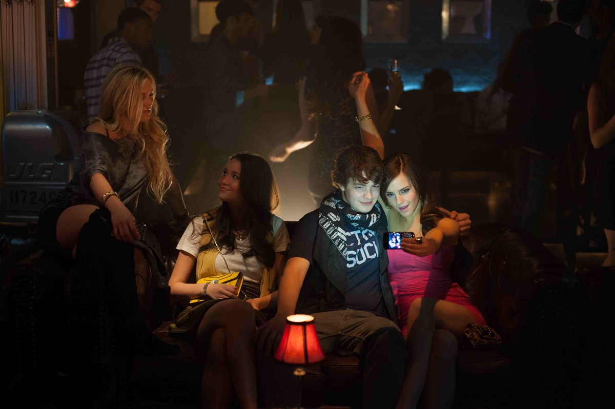
Like Marie Antoinette, we begin in the dark and end in the dark. As the kids first begin their heists, the colors are bright and happy. They are getting away with it, and they are enjoying life to the fullest, and we are drawn in along with them. But the darker their crimes get, the colors match. By the end, they have lost everything and so have we. We ended on a similarly dark tone that we started on. and we are prepared for that thanks to the initial color selection.
Color Versus Black And White
Color is what Coppola’s films are known for, and they are of great importance to the audience in determining the mood and inner challenges of the characters. However, this all raises a very important question: could Coppola’s films deliver a similarly impactful story if they were created in black and white, completely devoid of color?
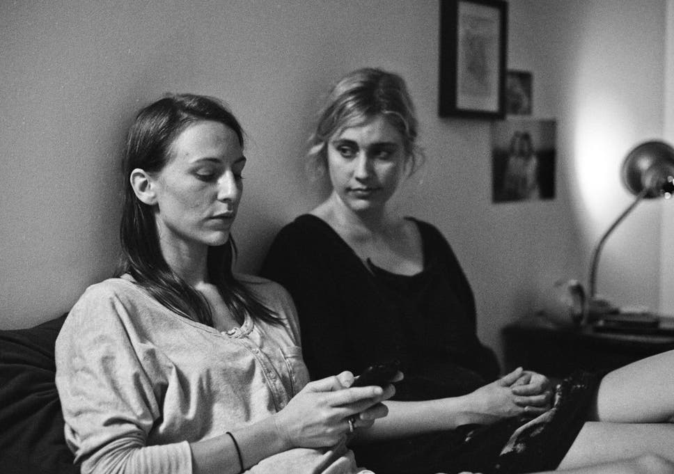
Black and white is a style that the film world we know and love today emerged from. Before color, stories had to be presented in black and white. The inner emotions of the character were presented through facial expressions, dialogue, and the sets of the movies. Color was an afterthought, and even when it was first introduced it wasn’t utilized for much more than a pretty effect.
Without color, Sofia Coppola’s films would still pack a powerful punch, though perhaps her own particular “style” wouldn’t have become quite as well known. We would still understand the tragedy of the Lisbon sisters in black and white, though perhaps it would have been less “dreamy,” in a sense, and more serious. Marie Antoinette would still be an understandable tale, but less exciting and beautiful. These stories would still be good, but they wouldn’t have hooked an audience. For another director maybe, but for Coppola, color is of the utmost importance.
The Real Impact Of Color
Without color, Sofia Coppola’s films would still be great. However, color adds an entirely new dimension to the characters and plot that we see. Without Marie Antoinette‘s vibrant pastels, the film would have been a strange modern take on a stuck-up dead queen. Without color, we wouldn’t have seen the visual transformation in Lost in Translation. Without beautiful hues, we wouldn’t feel the pain of the Lisbon sisters as they struggled with an abusive relationship with their parents.
Sofia Coppola’s color palettes let us know who her characters are. We are sucked into the story further through this unique vessel that she has centered all of her films on. Without it, the stories wouldn’t be the same, nor her characters as relatable. Color is an emotion in itself, and without it, we are lost. There is little doubt that Sofia Coppola will continue to use her color palettes to drive her characters forward, and it will be remarkable to see what she does next.
